| 일 | 월 | 화 | 수 | 목 | 금 | 토 |
|---|---|---|---|---|---|---|
| 1 | 2 | 3 | 4 | 5 | ||
| 6 | 7 | 8 | 9 | 10 | 11 | 12 |
| 13 | 14 | 15 | 16 | 17 | 18 | 19 |
| 20 | 21 | 22 | 23 | 24 | 25 | 26 |
| 27 | 28 | 29 | 30 |
Tags
- 미세먼지
- 제이쿼리
- 메뉴바만들기
- 자바스크립트 내장객체
- useState
- 자바스크립트
- 미세먼지알림사이트만들기
- 공공데이터 활용
- jQuery
- JS
- position
- FOR문
- 20231221
- 바닐라자바스크립트
- module.css
- css속성
- CSS
- HTML
- 리액트
- open api
- JavaScript
- css 속성
- Illustrator2022
- 아코디언카드만들기
- react
- 공공데이터
- 개발일지
- 퍼블리싱
- Js 내장객체
- 일러스트 입체글자
Archives
- Today
- Total
김코드의 웹디자인 세상
❏ css - on/off 버튼 만들기! 본문
오늘은 css로만 만들 수 있는 다양한 버튼들을 가져왔습니다!
매번 공부하면서 만들어보고 있습니다!
정말 공부하면서 느끼는 거지만 진짜 고수분들이 많으신 것 같네요..!
다시 한번 더 열심히 공부해야겠다는 생각이 듭니다! ദ്ദി '֊' )
1. 라운드형
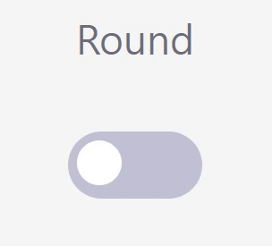
<!-- 라운드형 스위치  -->
<div>
<h2>Round</h2>
	<span class="switch">
		<input id="switch-round" type="checkbox" />
		<label for="switch-round"></label>
	</span>
 </div>
.switch{
display: inline-block;
}
.switch input{
display: none;
}
.switch label{
display: block;
width: 60px;
height: 30px;
padding: 4px;
border-radius: 15px;
background: #c1c1d4;
transition: 0.3s;
}
.switch label::after{
content: "";
display: inherit;
width: 20px;
height: 20px;
border-radius: 12px;
background: #fff;
transition: 0.3s;
}
.switch input:checked ~ label{
background: #2b87ea;
}
.switch input:checked ~ label::after {
translate: 30px 0;
background: #ffffff;
}
2. 각진형
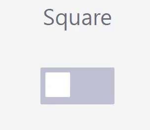
<!-- 각진 스위치 -->
<div>
<h2>Square</h2>
      <span class="switch square">
           <input id="switch-square" type="checkbox" />
           <label for="switch-square"></label>
      </span>
</div>
.switch{
display: inline-block;
}
.switch input{
display: none;
}
.switch label{
display: block;
width: 60px;
height: 30px;
padding: 4px;
border-radius: 1px;
background: #c1c1d4;
transition: 0.3s;
}
.switch label::after{
content: "";
display: inherit;
width: 20px;
height: 20px;
border-radius: 1px;
background: #fff;
transition: 0.3s;
}
.switch input:checked ~ label{
background: #2b87ea;
}
.switch input:checked ~ label::after {
translate: 30px 0;
background: #ffffff;
}
3. 선택 불가형
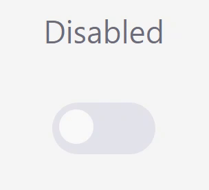
<!-- 선택 불가형 -->
<h2>Disabled</h2>
    <span class="switch">
        <input disabled id="switch-disabled" type="checkbox" />
        <label for="switch-disabled"></label>
    </span>
.switch{
display: inline-block;
}
.switch input{
display: none;
}
.switch label{
display: block;
width: 60px;
height: 30px;
padding: 4px;
border-radius: 15px;
background: #c1c1d4;
transition: 0.3s;
}
.switch label::after{
content: "";
display: inherit;
width: 20px;
height: 20px;
border-radius: 12px;
background: #fff;
transition: 0.3s;
}
.switch input:checked ~ label{
background: #2b87ea;
}
.switch input:checked ~ label::after {
translate: 30px 0;
background: #ffffff;
}
.switch input:disabled ~ label{
opacity: 0.35;
cursor: not-allowed;
}오늘도 내일도 열심히 해야겠네요..!
_〆(。╹‿ ╹。)
'⊹ ⠀𝙲𝚂𝚂, 𝚂𝙲𝚂𝚂' 카테고리의 다른 글
| ❏ css - 여러가지 keyframes 모음집! (0) | 2022.12.08 |
|---|---|
| ❏ css - 애니메이션(animation) 속성과 키프레임(@keyframse) (0) | 2022.12.08 |
| ❏ css - 그리드 레이아웃 (Grid Layout) (0) | 2022.12.06 |
| ❏ css- 아코디언 카드만들기 ➋ (1) | 2022.12.05 |
| ❏css, html - W3C Validator html,css 웹표준 검사하기 (0) | 2022.12.03 |
'⊹ ⠀𝙲𝚂𝚂, 𝚂𝙲𝚂𝚂' Related Articles
more


Comments